Case Study · UX/UI · Ed-tech · Mobile App
Fluency Content App
A new mobile experience to distribute free content from Brazil's largest online language school, opening a direct relationship channel with future students.
01 · Context
Free content as a growth engine
Fluency Academy is one of Brazil's largest online language schools. Founded with a focus on English and expanded to other languages over the years, the school became a reference in digital education. The central differentiator lies not just in the lesson content, but in how the school freely distributes knowledge: podcasts, videos, live sessions, ebooks and short videos reaching millions of people who are not yet paying students.
Free content is not a complement to the offering. It is the main relationship channel with future students, the channel through which the school builds familiarity and trust before any purchase decision. Whoever arrives via podcast or YouTube already knows the teachers, already trusts the approach. Conversion becomes a consequence of a relationship that begins long before enrollment.
02 · Problem
Categorizing wasn't enough. A system needed to be built.
The content already existed on Fluency's website. But the discovery and consumption experience was fragmented. Podcasts, videos, lessons and ebooks coexisted in sections with distinct visual identities, no unified language, no clear hierarchy for what to consume first, and no personalization layer whatsoever.
From the user's perspective, the website functioned like an archive, not a curated collection. For those arriving without knowing where to start, the abundance became an obstacle.
The app needed to serve two profiles simultaneously: paying students seeking deeper content and non-customers in an early stage of their relationship with the brand, with no context about the school and no familiarity with the teachers. The central challenge was creating, from scratch, a visual and navigation system the web platform had never had.
03 · Screens
Built in Figma with AI as part of the process
The screens were developed entirely in Figma. Artificial intelligence was part of the process from the start, contributing to image and visual asset generation, interface copy writing, token creation and naming, flow mapping and layout exploration. The goal was to move fast without compromising the reasoning behind each decision.
The screens below represent initial decisions in building the journey. The complete project flow contains a larger volume of screens and components. The rest, including handoff specifications and complete flows, is the company's intellectual property. Click any screen to expand.
Drag to see the initial screens →
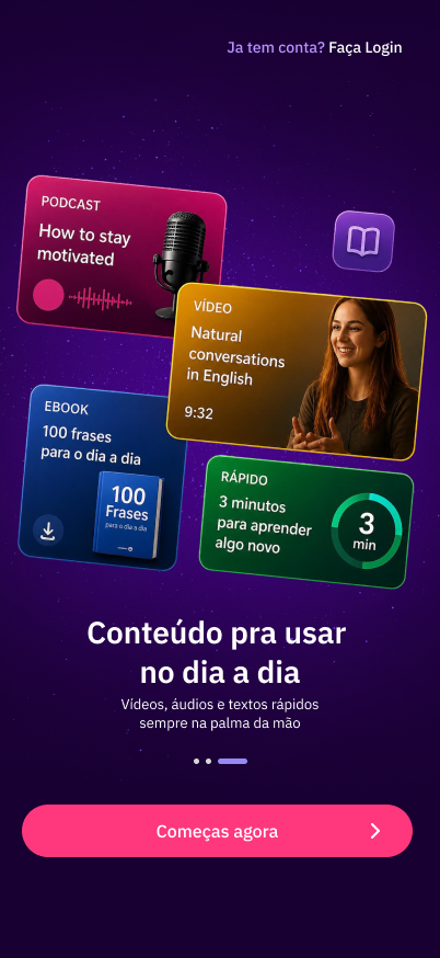
 Splash
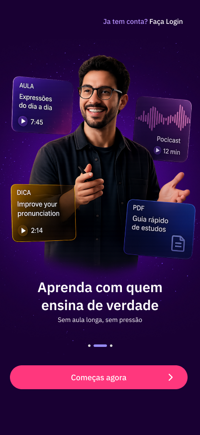
Onboarding 1
Splash
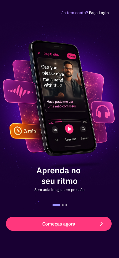
Onboarding 1
 Onboarding 2
Onboarding 3
Onboarding 2
Onboarding 3
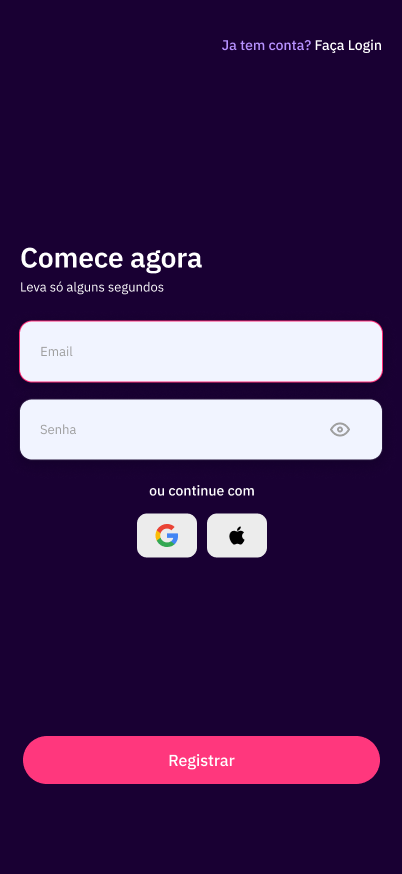 Sign Up
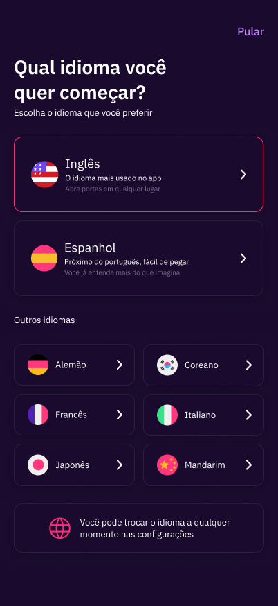 Language
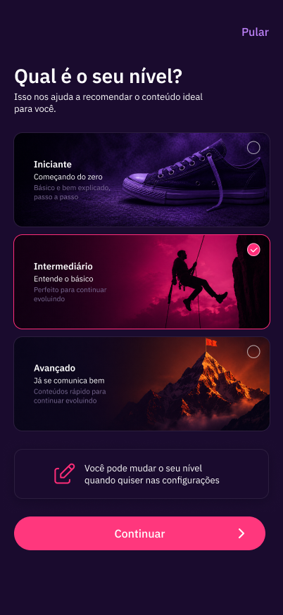
Level
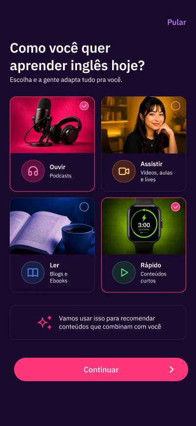
How to learn
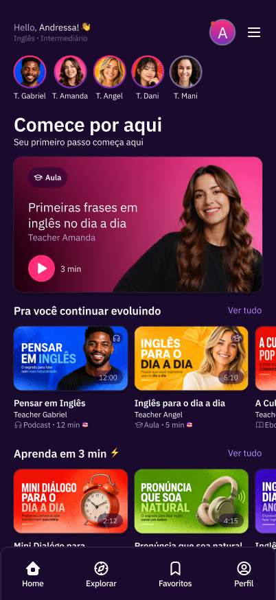
Home
Language
Level
How to learn
Home
04 · Experience choices
The decisions that shape the journey
05 · Visual system
Tokens built to scale
Fluency Academy's visual identity — purple with pink as an accent — was preserved and translated to mobile with a documented token system. The build started from scratch: the website had no formalized nomenclature, scale or reusable components.
6px
10px
12px
16px
50%
 Listen
 Watch
Watch
 Read
Read
 Quick
Quick
A few examples only. The full set follows a single standard of stroke weight and grid proportion.


06 · Reflection
Creating what the website never had
Fluency Content was not an adaptation project. It was a creation project: of visual identity for content formats, of navigation architecture, of a system the web platform had never had and that the app needed to have from the very first access.
The biggest lesson
Categorizing doesn't solve it. The content was already organized by type on the website. What was missing was a system that made each category recognizable and consistent at any point in the journey: from onboarding to the badge, from the card to the home screen.
The core exercise
Building for two very different profiles — the student who already knows the school and the lead with no context whatsoever — was the biggest challenge. Personalization at the start of the journey was the most direct and defensible answer to that problem.
Fluency Academy's visual identity was a starting point, not a constraint. The school's colors and language arrived on mobile with more structure and with components that scale — something that didn't exist before and that the team can build on from here.