Case Study · UX/UI · Embedded Display
AgriView X10
Visual Refresh
Structuring a visual system for an embedded agricultural display, from the inventory of 300+ screens to incremental phase-by-phase application, with documented tokens and handoff ready for rollout.
01 · Context
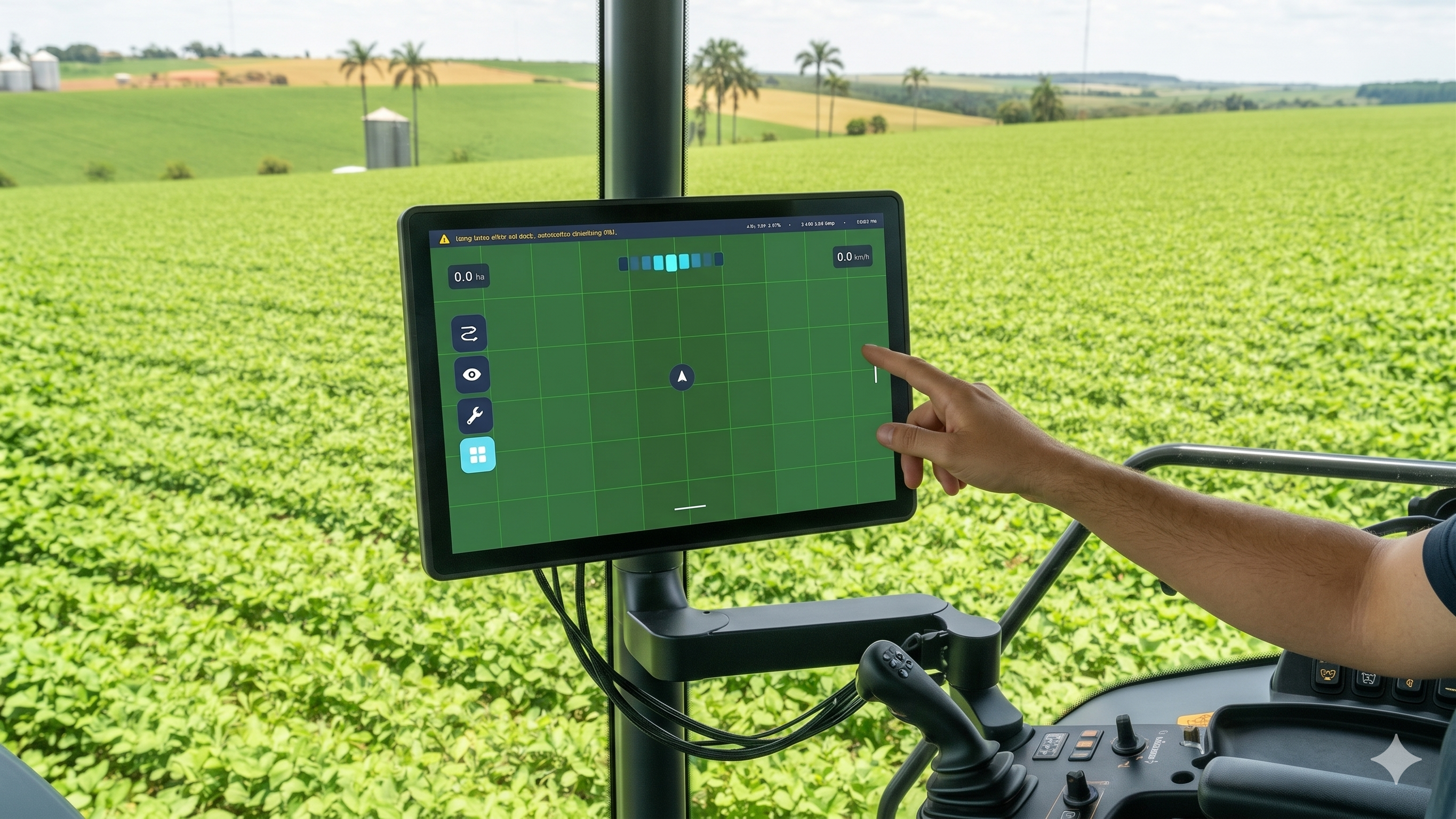
Embedded display in a field environment
The AgriView X10 is a display used in agricultural machinery cabins, operating under demanding conditions: constant vibration, dust, variable light between indoor environments and direct sunlight, and interaction via resistive touchscreen.
This context imposes a clear requirement: the interface must be quickly readable and predictable, even while in motion and with divided attention.
Over time, the system evolved incrementally without a structured design foundation. Visual decisions were made in isolation, with no consistency across screens.
In parallel, the company's core design team had already evolved the visual language of digital products, with structured color, typography and spacing definitions applied only to web and mobile. This mismatch motivated the visual refresh.
02 · Problem
Functional in the field, but without consistency
This feedback was not related to the amount of information, but to the lack of consistency. Without a defined visual system, patterns changed from one screen to another. Similar elements had different behaviors. Reading required more effort than necessary.
In practice, this increased the operator's cognitive load and reduced efficiency in interpreting information during operation.
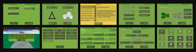
Legacy screens, absence of hierarchy and documented palette
Visual inconsistencies across screens, similar elements with different behaviors
03 · Development
Visual system applied in 7 phases
The project was structured as the creation of a visual system applied incrementally, accounting for technical constraints and the product's continuous use. Before defining the pilot, more than 300 screens were mapped, each categorized by type of change and level of technical dependency.
| Phase | Focus | Main Deliverables |
|---|---|---|
| 01 | Foundation | Inventory of visual elements and mapping of 300+ screens |
| 02 | Colors | Replacing fixed values with semantic tokens and defining color roles |
| 03 | Components & States | Standardization of components and states such as hover, focus and disabled |
| 04 | Icons | Unification into a single set with proportion and stroke weight rules |
| 05 | Spacing | Consistent 4px grid definition and spacing scale with named tokens |
| 06 | Typography | Structuring hierarchy and text roles with IBM Plex Mono and Inter |
| 07 | Handoff | Annotated screens in Figma, usage guide and checklist for rollout |
This process was guided by the company's existing visual guidelines, adapted from the web and mobile context to the embedded display system, considering real usage behavior and development constraints.
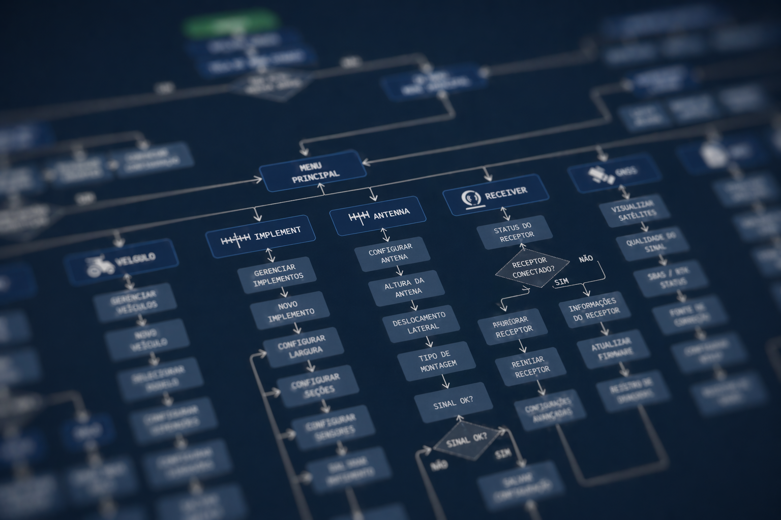
Project structure, incremental evolution by phases
04 · Solution
A consistent and documented visual system
The result was the creation of a visual system that replaces isolated decisions with clear, replicable rules. Field tests with users confirmed improved readability in different lighting conditions, clearer information hierarchy and consistent behavior across screens, reducing cognitive effort during operation.
This standardization brought predictability for users and sustainability for the product, facilitating future evolutions. The application was made gradually, respecting technical constraints and avoiding disruption for users already accustomed to the system.
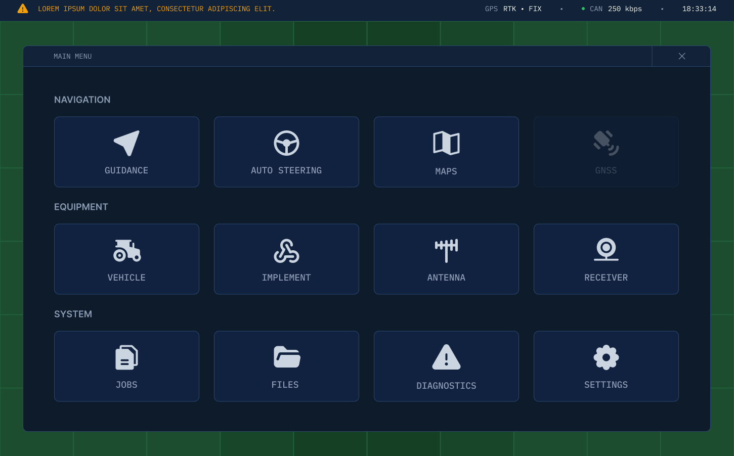
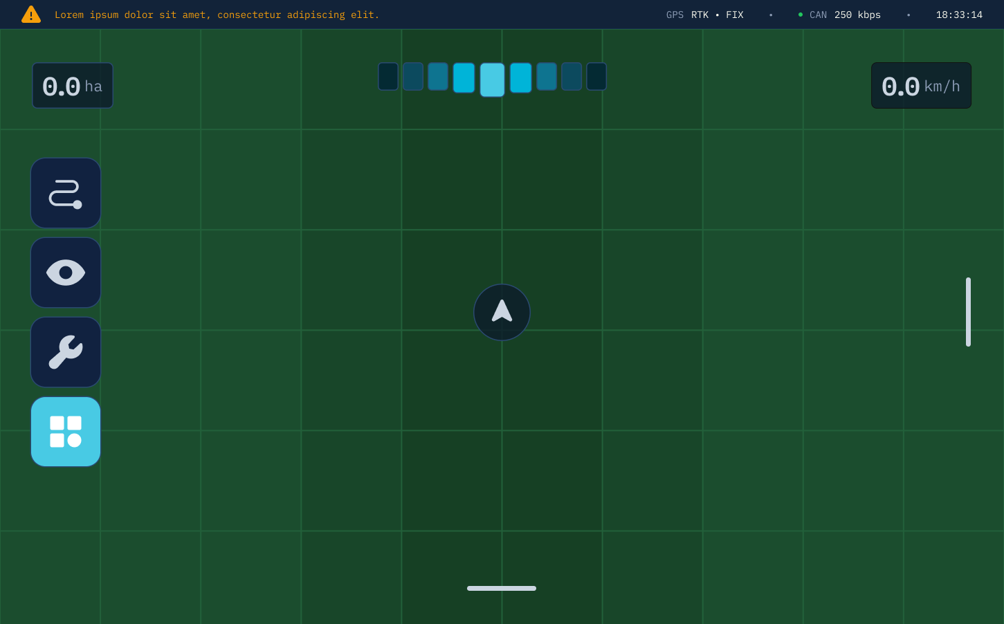
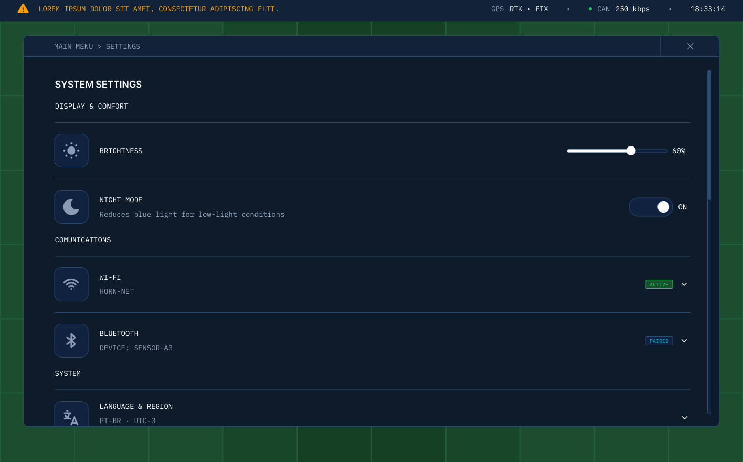
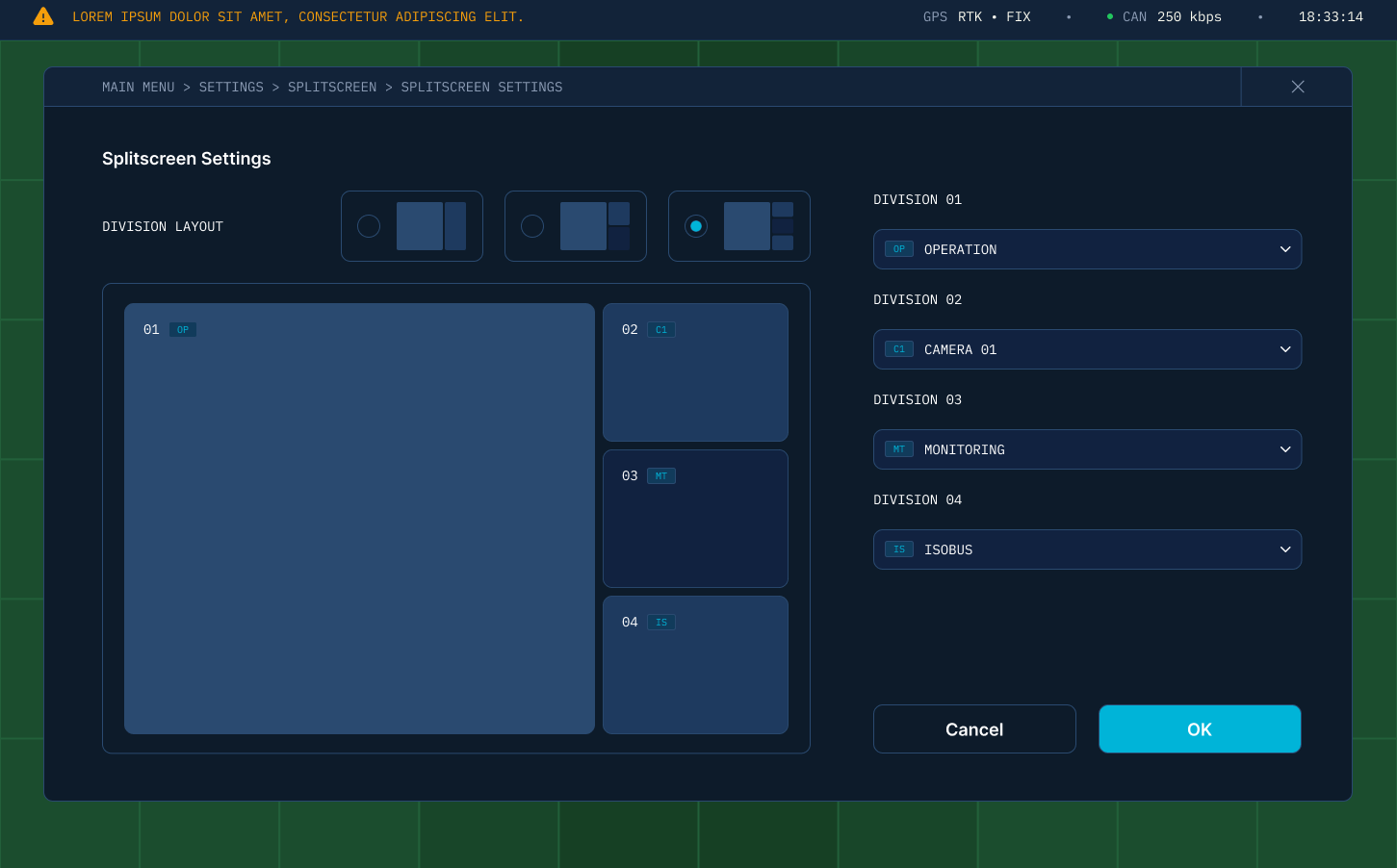
Redesigned screens, click to expand →
05 · Results
From ad hoc decisions to a scalable foundation
The project established a solid foundation for the evolution of the AgriView X10. The visual system became structured and documented. Consistency across screens increased. Readability in field environments improved. Cognitive effort was reduced.
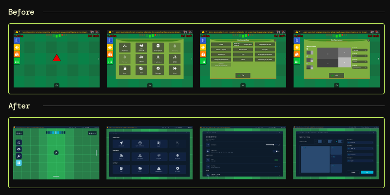
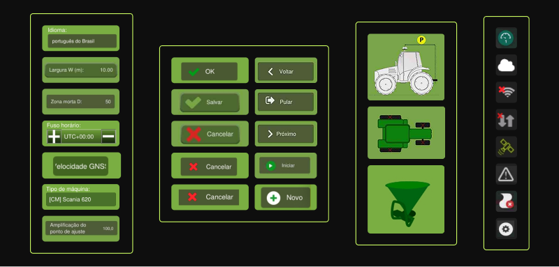
Application of the visual system on the pilot screens
06 · Reflection
Building a foundation that didn't exist
This project was not about changing the visual of the system. It was about building a foundation that didn't exist.
In an embedded environment, where use happens under adverse conditions, clarity and consistency are requirements, not differentiators. Common patterns in digital interfaces, such as transitions, flexible layout and hover-based interactions, simply do not apply to a resistive touchscreen inside a moving cabin.
As the designer responsible for the project, I led the system definition and its initial application, balancing user needs, technical constraints and product evolution. The phase-by-phase structure was both a project management and a design decision: a full redesign applied at once would have created discontinuity for operators who rely on spatial memory during their work.