Case Study · UX/UI · E-commerce · Feature Design
Aftersale · Referrals
Transforming an existing referral mechanism into a trackable, visible, continuous experience, integrated into the daily flow of the product.
01 · The program
A growth strategy users couldn't see
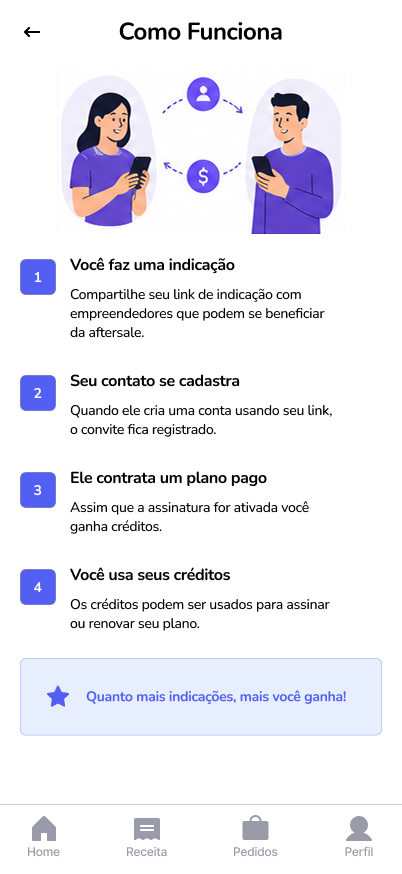
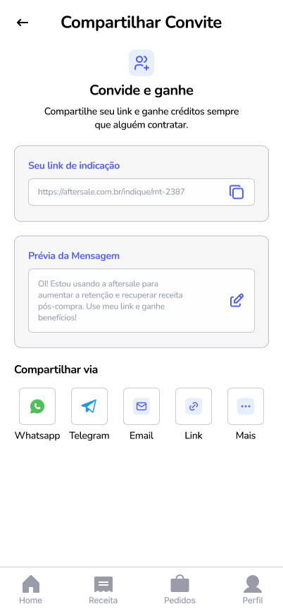
Aftersale already had a functioning referral program. Users could invite new customers and earn credits from each conversion. The mechanics existed, but lived at the margins of the main experience.
Referring was a one-time action. What happened next — which invites were accepted, which converted, how much was earned — remained uncertain. Without visible feedback, the program lost traction as an active growth channel.
02 · The unanswered questions
The program existed. The answers didn't.
Even while participating in the program, users couldn't easily answer three basic questions. Without those answers, referring stopped being a strategy and became an act of faith.
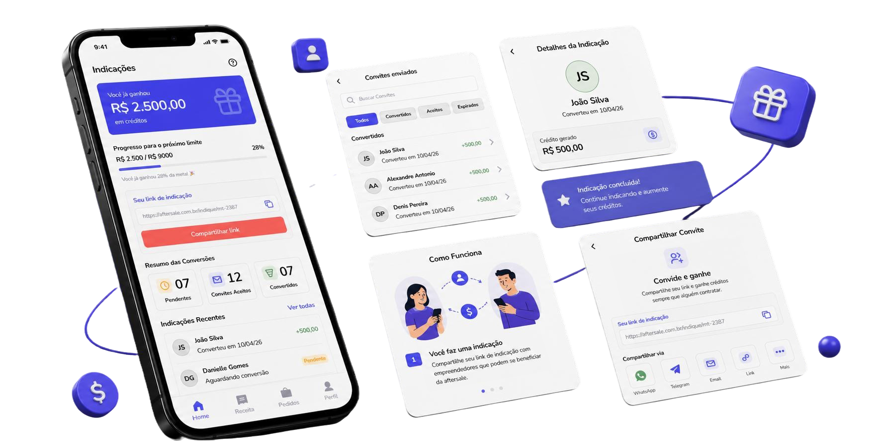
03 · The feature structure
Three connected elements that answer the three questions
The referrals screen was built as a tracking area, not an isolated menu. The organization is not arbitrary: each section directly answers one of the questions users couldn't answer before.
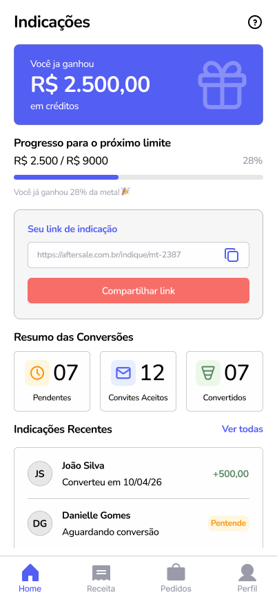
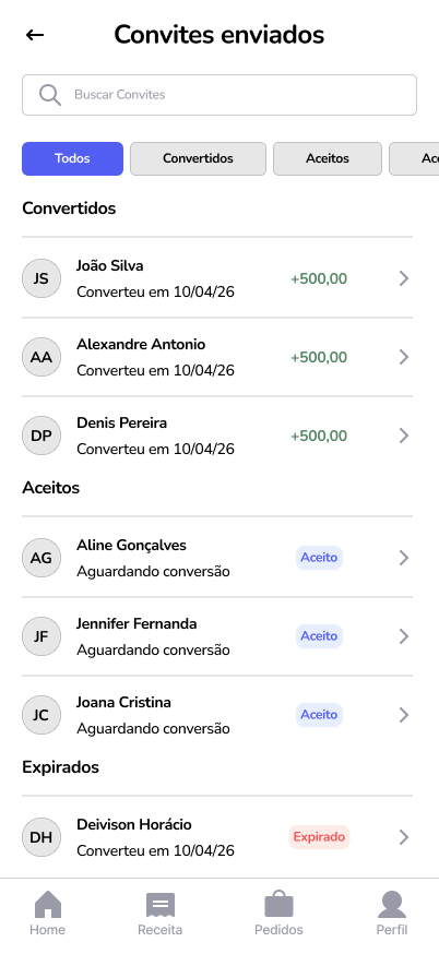
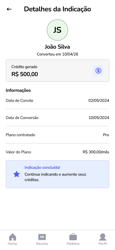
04 · The screens
The tracking flow
From the overview of results to sharing the link, including the detailed history of each referral. The screens cover the full journey users follow within the program. The Aftersale app includes other areas that are outside the scope of this case.
Drag to explore →
05 · How the screen organizes reading
Hierarchy before layout
The central decision in this project was not about layout, it was about hierarchy. Before defining where each element would go, it was necessary to define what users should see first, second, and when they wanted to dig deeper. The layout followed that order, not the other way around.
06 · Reflection
Visible results drive continuity
The central challenge of this project was not creating something new — the referral mechanism already existed. It was finding the structure that would make that mechanism understandable and motivating in the daily use of the product.
The feature doesn't change the program. It changes the user's relationship with it. When the result is visible, referring stops being a passive possibility and becomes an active strategy, something users choose to repeat because they understand the return.